How to make a responsive menu with CSS

If you are one of those all-rounder programmers in which no day is the same for you in the work environment and you have to deal with anything from a layout to a WPO, this article is of interest to you.
When we talk about optimising a website we usually think of actions such as improving server resources, minifying files or reducing the size of images. But many times we find that no matter how much we do, the speed is still slow. When this happens we should start looking inside the website and check if the functionalities we are using are useful and if they are optimised.
One of the most common cases and one that is most noticeable in the metrics of the speed meters is the duplication of the header link menus. A high percentage of pages load two menus regardless of the device on which they enter: one for desktop size and another for reduced size (tablet and mobile).
Unify the duplicate menu structure
The first thing to do is to program the HTML code that will divide the menu into blocks:
<header class="header">
    <nav class="navbar navbar-expand-lg fixed-top py-3">
        <div class="container">
            <button type="button" data-toggle="collapse" data-target="#navbar" aria-controls="navbar" aria-expanded="false" class="navbar-toggler navbar-toggler-right"><i class="fa fa-bars"></i></button>
            <div id="navbar" class="collapse navbar-collapse">
                <ul class="navbar-nav ml-auto">
                    <li class="nav-item active">
                        <a href="#" class="nav-link text-uppercase font-weight-bold">Inicio</a>
                    </li>
                    <li class="nav-item"><a href="#" class="nav-link text-uppercase font-weight-bold">Sobre nosotros</a></li>
                    <li class="nav-item"><a href="#" class="nav-link text-uppercase font-weight-bold">Galería</a></li>
                    <li class="nav-item"><a href="#" class="nav-link text-uppercase font-weight-bold">Portfolio</a></li>
                    <li class="nav-item"><a href="#" class="nav-link text-uppercase font-weight-bold">Contacto</a></li>
                </ul>
            </div>
        </div>
    </nav>
</header>
We will then shape it with the styles that will adapt the block to different devices:
.navbar {
   transition: all 0.4s;
   background: #3d5e9b;
}

.navbar .nav-link {
   color: white;
}

.navbar .nav-link:hover,
.navbar .nav-link:focus {
   color: black;
   text-decoration: none;
}

.navbar .navbar-brand {
   color: #fff;
}

.navbar.active {
   background: #fff;
   box-shadow: 1px 2px 10px rgba(0, 0, 0, 0.1);
}

.navbar.active .nav-link {
   color: #555;
}

.navbar.active .nav-link:hover,
.navbar.active .nav-link:focus {
   color: #555;
   text-decoration: none;
}

.navbar.active .navbar-brand {
   color: #555;
}

@media (max-width: 991.98px) {
   .navbar .navbar-brand,
   .navbar .nav-link {
       color: white;
       padding-left: 50px;
   }
}
For all this to work it is important to have the Boostrap library active in your CMS. If this is not the case you simply add the necessary resources in the HEAD as follows:
<head>
    <link href="https://cdn.jsdelivr.net/npm/bootstrap@5.1.1/dist/css/bootstrap.min.css" rel="stylesheet" />
    <script src="https://cdn.jsdelivr.net/npm/bootstrap@5.1.1/dist/js/bootstrap.bundle.min.js"></script>
</head>
The final result on desktop screens will be:

And on small devices:

In short, if you have basic programming skills, it is relatively easy to adapt a single menu to all devices. In this way you will be getting a better optimisation of your website and a cleaner and more scalable code.
Latest Posts

How to use Google Search Console and ScreamingFrog to perform a technical audit of your domain
Using APIs to connect Google Search Console with ScreamingFrog This is the second guide on…

Google Search Console Guide: secrets on Performance Analysis
This is the first part of a comprehensive set of articles on Google Search Console…

The secrets of Google’s algorithm leaked. Will SEO change from now on?
The world of SEO and Digital Marketing has been revolutionized by the alleged leak of…

The 8 essential tips for an SEO strategy for casinos
In this article, we offer you a detailed guide to optimizing your online gambling or…

How to Create Search Engine Optimized Content Without Sacrificing Quality
When writing content, we often find ourselves faced with a dilemma: is it possible to…

How to optimize the product sheets of your ecommerce: Guide 2024
Guide to product sheets in 2024 for ecommerce The product sheets of any e-commerce are…

How SEO can boost your company’s sales
Relationship between SEO and your company's sales In the world of modern commerce and digital…

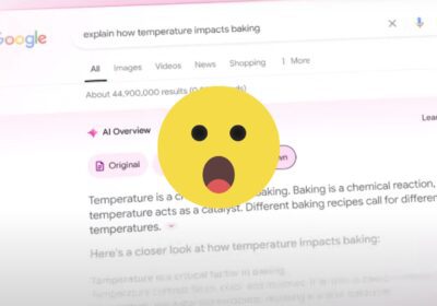
How to block access to Ai Overviews. Google updates its documentation
The recent update to the official documentation page refers to several news about the recent…

How to Optimize Content for Voice Search in 2024
Voice searches are fundamentally changing how users interact with technology in daily life. With the…

Web Errors | 404, 403, 503, 502, 401 | Meaning and Solutions
In other posts like this one about the error 500 in WordPress, we've covered some…
More AI in Google Search with the Announcement of AI Overview
Out of all the announcements we have seen at the 2024 Google I/O event, the…

Revolutionize your SEO with Entities: Beyond Keywords
The term "entities" has become super popular in the SEO and digital marketing sector in…
How to connect Screaming Frog with ChatGPT to use in your Crawls
The latest version of Screaming Frog is amazing. The inclusion of custom JavaScript to run…

How to Get Chat GPT to Recommend Your Brand
It's becoming increasingly clear that more and more people are using Chat GPT like a…

How to analyze SEO competition with Sistrix
SEO competition analysis is a fundamental process when we are trying to audit the status…

Ultimate Guide to Create a Sales Funnel in Google Ads
The sales funnel represents the customer's journey from brand awareness through the consideration stage, and…
Universal Analytics will stop working as of July 1, 2024. How to prepare?
On July 1, 2024, Google Analytics 4 properties will have completely replaced Universal Analytics properties.…

UGC creators: what are they and what differentiates them from influencers
A study conducted by Harris Interactive says that 90% of consumers make purchasing decisions based…

Sistrix: one of the best SEO tools
In the world of SEO, tools are a decisive factor in being able to offer…

How to create Evergreen content that drives traffic to your website in the long term
Within the creation of content for your website, one of the most effective strategies is…