When it comes to coming up with content strategies for your website, the first thought that probably pops into your head is: “ok, let’s blog!”.
This was all well and good in 2009, in 2010, 2011… But it’s no longer good enough. Google’s moves in recent years, such as the push for AMP to improve loading speed, and the intentions already in the medium term (!Hello?? Core Web Vitals Update just around the corner!!!) suggest that they want content that loads fast, resolves search queries quickly and boosts engagement.
When it comes to content, or rather content strategy, Web Stories are a win-win from a performance, quality and engagement perspective.
The amount of official information that has been published since 2020 and the depth of the guides that have been published indicates that those who are betting on this type of content will be rewarded in search results.
Let’s get the typical definitions and all that blah blah blah out of the way first, and then I’ll go full-on proselytizing for you to install and test Google Web Stories in your boring wordpress project.
What are Google Web Stories.
Google Web Stories are a type of content designed for mobile consumption in which video, image and text are combined to tell a story in a quick, direct and visual way.
Examples of Google Web Stories.
Hunting them down is difficult, for now, although Google indicates them in various ways, they are diluted and confused with AMP results. Here’s a list of a few:
11 forward-thinking designers at Bustle.com
5 destinations to see nature with your kids from Lonelyplanet.com
The top-rated video game streamers on Theloadout.com
Where do Google Web Stories show up?
For now, certain implementations, mostly related to Discover, are only available in the US, India and Brazil. Especially in the case of Discover and the Web Stories carousel. An element that when it arrives in Spain I am sure will be exploited by media outlets such as La Vanguardia, Marca, etc…
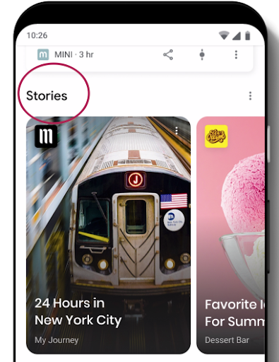
They look like this:

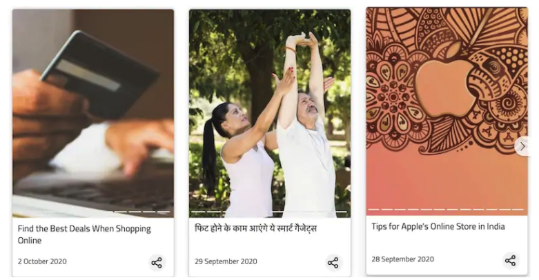
It’s already looking like this in India:

But it’s not just there that they can appear. With various tests we’ve done on search results we’ve found similar results to this:

As you can see, Lonely planet has gone all in with this type of content, and the results include a longer-than-normal image, a new symbol with more visibility, and the familiar AMP lightning bolt symbol.
They can also be found on Google Images, though mostly in English-language searches. Here’s another example:

How to create Google Web Stories in WordPress.
If you want to start applying them to your WordPress, in this link to the official Google website you have a lot of resources.
As everything is mostly implemented via plug-ins, the technical implementation is really simple, however:
Remember that this is an AMP technology, and you need to have a working AMP installation on your website first. There is no point in investing resources in Google Web Stories if your AMP pages have construction problems or do not follow official guidelines.
Stats about Google Web Stories to set your teeth on edge.
How can we justify to our superiors, bosses and clients that Web Stories are worth the investment? Easy, we need data. We need data.
In this Semrush study written by Olga Andrienko, a lot of crunchy data emerges:
-The average position of Web Stories is between 5th and 6th.
-A single Google Web Story can appear in up to 5 different search results items.
– The most prominent use of this type of content is in:
- Travel sector.
- Recipes
- Fashion.
- Video games.
The icon that highlights stories in Google Images has an animation. Yes, you read that right. The icon that highlights stories in Google Images has an animation.
From Google, in official documents, the use of these Google Web Stories for bloggers, content creators and influencers, small businesses and even large companies or brands is supported.
As you can see, it’s a broad format that can fit many types of companies or organizations.
Google Web Stories can be a brutal opportunity to create a more visually appealing website.
This is a vital point. Putting aside pure SEO issues, Google Web Vitals are an excellent opportunity to give the layout and feel of your website a makeover.
Websites and media that we all know have already gone for this:
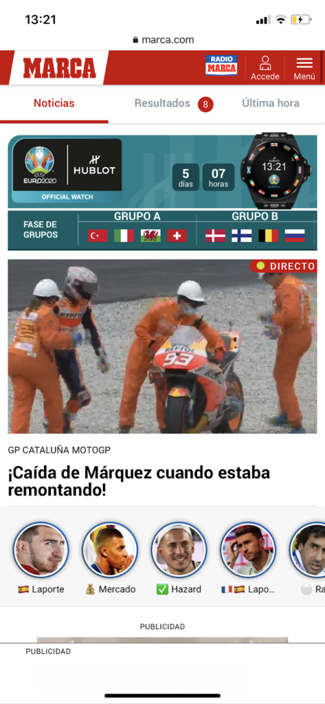
An example… This website that I show you below that almost nobody visits. We have already made a bet on this one.

Yes, you know those little circles with faces? Exactly, the same visual appearance as instagram stories.
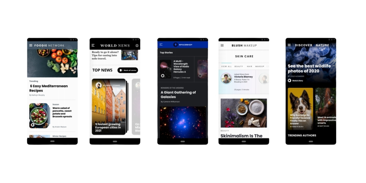
A document you should check out 100% if you are considering implementing Google Web Stories is the official playbook published by Google with design examples of how you can integrate Google Web Stories into your WordPress.
Five types of implementations in web design look very good:

Recommendations when creating Google Web Stories. Within the abundant official documentation on Google Web Stories, it is pointed out several times that special attention should be paid to the following points:
- Focus on telling an interesting story.
- Use a powerful, high quality, high resolution opening image and an attractive title.
- Just as in “traditional” SEO, titles are extremely important here.
- Use images and videos that fit the mobile format.
- Keep title text under 10 words per page. Minimum font size of 24, always playing with contrast.
- Texts of less than 200 words per page. In this aspect it is vital to be specific and not to fill the screen with text. Provide them to the reader when they need them and, in addition, it is key that the reader knows where to access the extra content.
- Videos of less than 15 seconds.
- Add subtitles to the most interesting videos, create inclusive formats.
- Enhance storytelling, create content that makes you want to click on it to move forward in the story’s plot.
- Pay attention to the transitions between pages.
Benefits of Google Web Stories.
Benefits of Google Web Stories. Benefits of Google Web Stories.
Summarizing a bit this post we can, by way of closure I list you the benefits of using this type of content in your WordPress.
In terms of web design:
- Easy implementation in WordPress.
- Flexible implementation. We can use several types of Layouts.
- Highly clickable.
- Very easy to share.
- Fully mobile friendly.
- Very visual, little text.
- Entry points easily customisable to match brand colours.
- Immersive design. We only see the content on the screen, there are very few points of distraction.
In terms of positioning:
- Very useful for clustering content.
- Allows you to include keywords and links.
- Own URL, works like any other “post”.
- Very simple consumption. With a tap, you can scroll through the web stories and navigate through the content in a very visual way.
- Extremely fast. By having the AMP technology behind, we forget about penalties in the whole issue of Core Web Vitals.
