Flexbox, or Flexible Box Layout, is a CSS layout model that provides an efficient way to distribute elements within a container and dynamically align them.
Previously, developers had limited options, such as using ‘float’, which were not cross-browser compatible and difficult to scale to accommodate different screen resolutions. Flexbox overcomes these limitations by offering a set of properties and values that allow for vertical and horizontal centering of blocks, while also ensuring that all columns within a container have the same height, regardless of the amount of content they contain.
Prerequisites
To fully understand this post, it’s not necessary to be an expert in HTML and CSS, but it is important to have basic knowledge of how these technologies work.
What are we going to see
First, we will examine how rows and columns work to learn how to distribute objects within them. Then, we will review how to use the `justify-content` and `align-items` properties to position a button inside its container and effectively center it. Subsequently, we will delve into the use of `flex-direction` and `flex-wrap` to understand how to work with rows and columns, thus building a flexible grid system.
Once these concepts are mastered, we will see a practical example of how to apply Flexbox in a landing page, implementing a menu and a small grid. We will use all the techniques learned earlier to achieve an efficient and adaptable design.
Rows and columns
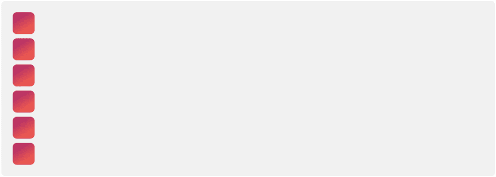
In Flexbox, the row and column properties allow us to determine the direction in which the elements of a container will align. To better understand this example, we’ll use the following HTML and CSS:
HTML:
<!DOCTYPE html>
<html lang="es">
<head>
   <meta charset="UTF-8">
   <meta name="viewport" content="width=device-width, initial-scale=1.0">
   <link rel="stylesheet" href="styles-3.css">
   <title>Introducción a Flexbox</title>
</head>
<body>
   <div>
       <div></div>
       <div></div>
       <div></div>
       <div></div>
       <div></div>
       <div></div>
   </div>
</body>
</html>
CSS:
* {
   margin: 0;
   padding: 0;
   box-sizing: border-box;
   font-family: 'Roboto', sans-serif;
}
.container {
   padding: 22px;
   background-color: #f3f3f3;
   border-radius: 10px;
   width: 100%;
   display: flex;
}
.box {
   padding: 12px 26px;
   border-radius: 10px;
   background: linear-gradient(148deg,#bf3a70 29%,#e75f58 71%);
   color: white;
   aspect-ratio: 1/1;
   margin: 5px;
   max-width: 20px;
}
Row
This is the default way of flex. Using this property, the elements are distributed horizontally:
.container {
   padding: 22px;
   background-color: #f3f3f3;
   border-radius: 10px;
   width: 100%;
   display: flex;
   flex-direction: row;
}
Column
This way the content is distributed horizontaly:
.container {
   padding: 22px;
   background-color: #f3f3f3;
   border-radius: 10px;
   width: 100%;
   display: flex;
   flex-direction: column;
}
Positioning an element inside its container
We will star with an html and CSS code for this example:
HTML:
<!DOCTYPE html>
<html lang="es">
<head>
   <meta charset="UTF-8">
   <meta name="viewport" content="width=device-width, initial-scale=1.0">
   <link rel="stylesheet" href="styles-2.css">
   <title>Introducción a Flexbox</title>
</head>
<body>
   <div>
       <div>
           Texto 1
       </div>
   </div>
</body>
</html>
CSS:
* {
   margin: 0;
   padding: 0;
   box-sizing: border-box;
   font-family: 'Roboto', sans-serif;
}
.container {
   padding: 22px;
   background-color: #f3f3f3;
   border-radius: 10px;
   width: 400px;
   height: 400px;
   display: flex;
}
.box {
   padding: 22px;
   border-radius: 10px;
   width: 160px;
   height: 60px;
   text-align: center;
   background: linear-gradient(148deg,#bf3a70 29%,#e75f58 71%);
   color: white;
}
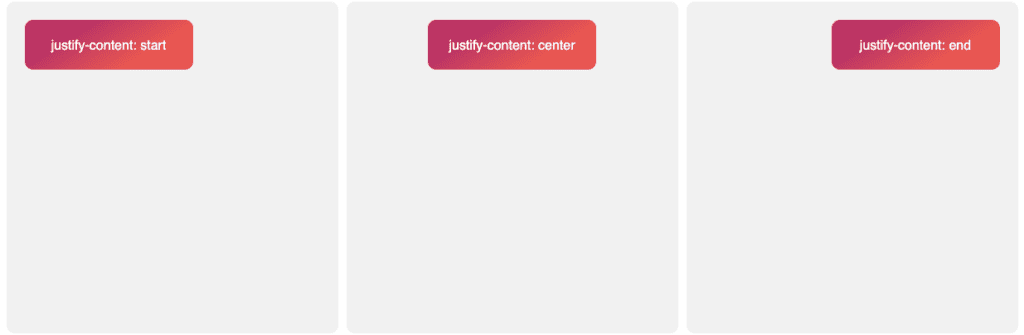
justify-content
This method allows us to align one block horizontaly depending on the width of our father element, in this case “.container”.
.container {
   padding: 22px;
   background-color: #f3f3f3;
   border-radius: 10px;
   width: 400px;
   height: 400px;
   display: flex;
   justify-content: /* start, center o end */;
}
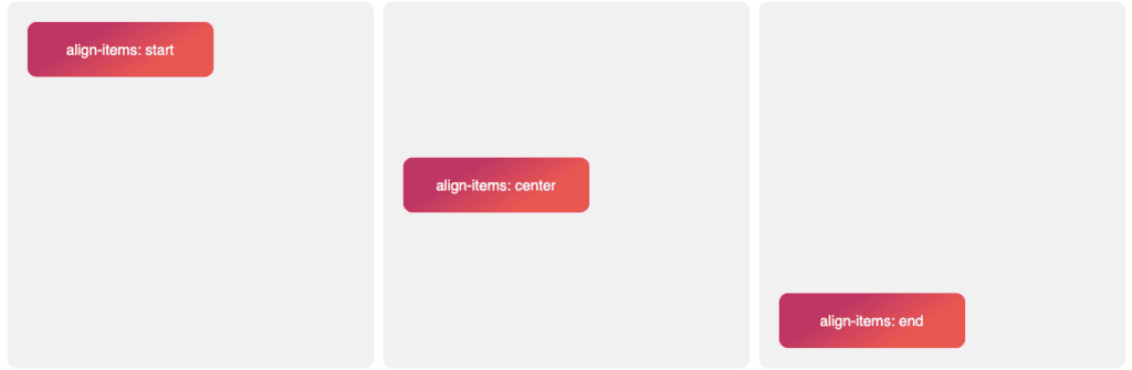
align-items
This other method allows us to align this object in a vertical form:
.container {
   padding: 22px;
   background-color: #f3f3f3;
   border-radius: 10px;
   width: 400px;
   height: 400px;
   display: flex;
   align-items: /* start, center o end */;
}
Center an element within its container
The two functions we just explored make centering a div simple and, most importantly, ensure that the element remains centered across all resolutions and in all browsers. To achieve this, we just need to use the following code:
.container {
   padding: 22px;
   background-color: #f3f3f3;
   border-radius: 10px;
   width: 400px;
   height: 400px;
   display: flex;
   justify-content: center;
   align-items: center;
}
Space-between, space-around and space-evenly
As we’ve mentioned before, justify-content gives us precise control over the distribution of elements. Now let’s see how to distribute space between multiple elements within a container. For this, we’ll use the example of a menu. Let’s start with this code:
HTML:
<!DOCTYPE html>
<html lang="es">
<head>
   <meta charset="UTF-8">
   <meta name="viewport" content="width=device-width, initial-scale=1.0">
   <link rel="stylesheet" href="styles-3.css">
   <title>Introducción a Flexbox</title>
</head>
<body>
   <div>
       <div>Home</div>
       <div>Quiénes somos</div>
       <div>Actividad</div>
       <div>Proyectos</div>
       <div>Blog</div>
       <div>Contacto</div>
   </div>
</body>
</html>
CSS:
* {
   margin: 0;
   padding: 0;
   box-sizing: border-box;
   font-family: 'Roboto', sans-serif;
}
.container {
   padding: 22px;
   background-color: #f3f3f3;
   border-radius: 10px;
   width: 100%;
   display: flex;
}
.box {
   padding: 12px 26px;
   border-radius: 10px;
   background: linear-gradient(148deg,#bf3a70 29%,#e75f58 71%);
   color: white;
}
We should now have something that looks like this:

space-between
This way, Flexbox will evenly distribute space among all elements in the container, resulting in the first and last elements being aligned with the edges, and the intermediate elements being equally spaced apart. This technique is particularly useful when aiming to make the most of the available space within a container.
.container {
   padding: 22px;
   background-color: #f3f3f3;
   border-radius: 10px;
   width: 100%;
   display: flex;
   justify-content: space-between;
}
space-around
The `space-around` value evenly distributes the elements along the main axis and leaves equal space at each end of the container. This feature enhances readability and the aesthetics of the design by providing a breathable margin between the elements and the container’s edges, contributing to a more balanced layout.
.container {
   padding: 22px;
   background-color: #f3f3f3;
   border-radius: 10px;
   width: 100%;
   display: flex;
   justify-content: space-around;
}
space-evenly
Finally, with `space-evenly`, we achieve equal spacing between all elements, including the ends. Thanks to this, we achieve a more symmetrical layout.
.container {
   padding: 22px;
   background-color: #f3f3f3;
   border-radius: 10px;
   width: 100%;
   display: flex;
   justify-content: space-evenly;
}
Examples of its use in a landing page
After reviewing everything we’ve seen so far, we can efficiently create layouts. For instance, using the following code, we could develop a basic layout for a webpage:
HTML:
<!DOCTYPE html>
<html lang="es">
<head>
   <meta charset="UTF-8">
   <meta name="viewport" content="width=device-width, initial-scale=1.0">
   <link rel="stylesheet" href="styles.css">
   <title>Introducción a Flexbox</title>
</head>
<body>
   <div>
       <nav>
           <img src="logo.svg" alt="Logo">
           <ul>
               <a href="#">Inicio</a>
               <a href="#">Actividad</a>
               <a href="#">Blog</a>
               <a href="#">Contacto</a>
           </ul>
       </nav>
       <div>
           <h2>Nuestras especialidades</h2>
           <div>
               <div>
                   <img src="post.jpeg" alt="Card 1">
                   <h3>SEO</h3>
               </div>
               <div>
                   <img src="post.jpeg" alt="Card 2">
                   <h3>SEM</h3>
               </div>
               <div>
                   <img src="post.jpeg" alt="Card 3">
                   <h3>Analytics</h3>
               </div>
               <div>
                   <img src="post.jpeg" alt="Card 4">
                   <h3>Desarrollo Web</h3>
               </div>
           </div>
       </div>
   </div>
</body>
</html>
CSS:
/* Generales */
* {
   margin: 0;
   padding: 0;
   box-sizing: border-box;
   font-family: 'Roboto', sans-serif;
}
body {
   background-color: #f3f3f3;
}
h2.title {
   display: block;
   margin: 0 auto 22px auto;
   width: fit-content;
}
.container {
   padding: 22px;
   border-radius: 10px;
   max-width: 800px;
   padding: 0 15px;
   margin: auto;
}
/* Navbar */
nav.navbar {
   padding: 22px 0 62px 0;
   display: flex;
   flex-direction: column;
   align-items: center;
   gap: 60px;
}
ul.navbar-nav {
   width: 100% !important;
   display: flex;
   justify-content: space-around;
   padding: 15px 0;
   border-top: 1px solid black;
   border-bottom: 1px solid black;
}
.nav-link {
   display: block;
   width: 100px;
   text-align: center;
   color: #1d1d20;
   text-decoration: unset;
   text-transform: uppercase;
   font-weight: bold;
}
/* Grid cards */
.last-cards {
   display: flex;
   flex-wrap: wrap;
}
.card {
   width: 50%;
   position: relative;
   padding: 5px;
}
/* Cards */
.card {
   display: flex;
   justify-content: center;
   align-items: center;
}
.card-img {
   width: 100%;
}
h3 {
   position: absolute;
   color: white;
}
@media screen and (max-width: 575px) {
   .last-cards {
       flex-direction: column;
       gap: 15px;
   }
   .card {
       width: 100%;
       max-height: 150px;
       overflow: hidden;
   }
}
This code uses Flexbox to organize the elements of the homepage in a structured way, allowing us to achieve efficient distribution and alignment of the different components. With Flexbox, we can easily adapt this layout to different devices and screen sizes, ensuring a consistent and appealing user experience across all devices.
Desktop 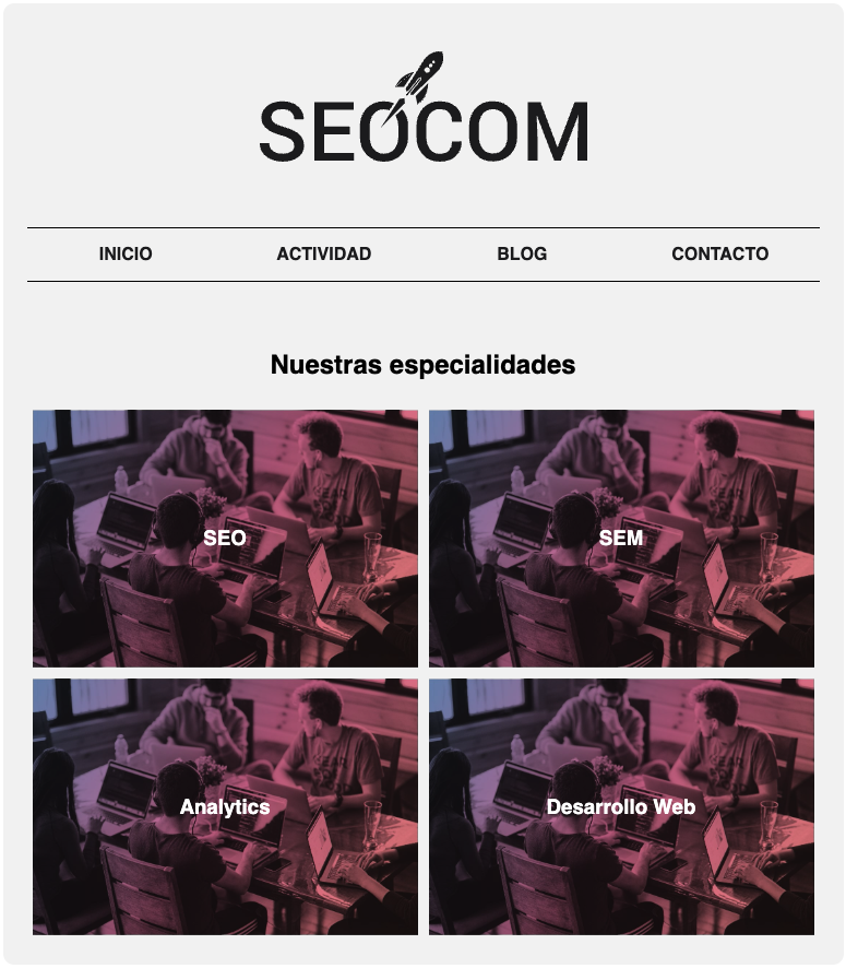 Mobile
  Using this property
